CalendarWizard
CalendarWizard.py has been one of the scripts included with Scribus for quite some time. It's a complex script that uses tkinter to create a multisetting dialog to set various parameters. Something which is hard-coded into the script is the layout, which makes some calculations based on the page size and its margins, and the proportion allotted to the actual calendar space at the bottom is assigned.
I was disappointed that this careful calculation ends up with a very large image frame which seems to crowd out the business part of the calendar. Manually editing the final calendar is certainly possible, but some work, and a lot of work if you would be trying to edit an entire year. Therefore I searched the script to try to find where this space distribution was determined. I was able to find a point to edit the script minimally to produce a redistribution of the spaces.
Look at this section:
    def goldenMean(self, aSize):
        """ Taken from samples/golden-mean.py."""
        return aSize * ((sqrt(5) - 1)/2)
Here a "golden mean" is calculated, and this is used to determine the size of the calendar areas at the top and bottom. ((sqrt(5) - 1)/2) is going to be a bit more than half – 0.618, so presumably this must be close to the proportion allotted to the image.
If we changed this to simply half, and comment out the original line:
    def goldenMean(self, aSize):
        """ Taken from samples/golden-mean.py."""
       return aSize * 1/2
#        return aSize * ((sqrt(5) - 1)/2)
The result
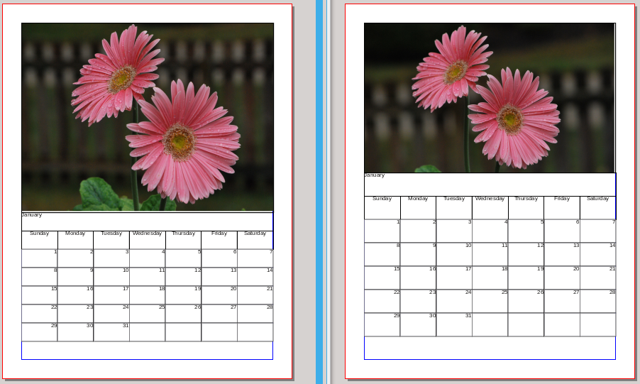
Here is the result of this change, on US Letter pages. The left document uses the original calculation, and the right this simple 50% calculation. This can probably be improved upon according to taste, but now you can see a specific point to make a big impact. What I'd like to do next is figure out how to stretch the bottom section a bit while keeping the image size as is.
I should add that the images were edited to fill the frame in each case, keeping the same proportions but adjusting scaling and XPos or YPos a bit as needed. If you look carefully, you can also see that these are two different pictures of the same subject.
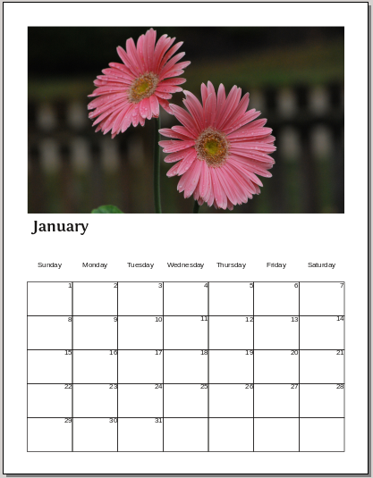
Here is a combination of hacking and editing in Scribus. In this example, I changed the factor to 5/12 instead of 1/2, then grouped the calendar part, moved it down to the margin, then increased the image frame height. Something you notice at this point is that the days of the week are on a Master Page, so you need to edit that to move that row down. I tried adding a horizontal guide to help with this, but unfortunately, guides aren't visible on the Master Pages – a workaround would be to move them to the page, but if you're doing a whole year's calendar, you would then need to copy/paste to each calendar page. I also vertically centered the days in the frames as you can see.
With A4 paper, you can move the calendar and days of the week down 60 points, and thus can enlarge the image height by 60 points.

