Evolution of a logo
| Installation • Usage • PDF issues • Imposition • Other |
Introduction
This article takes the reader through a fictional creative process of making a new company logo from first sketch to 3D model. You will see how you can use different free/open-source applications to create something from beginning to end.
This article is not meant to show you how to create the logo step-by-step. It has been created to, hopefully, give inspiration to people who might want to look at different software but didn't know where to start or what they could do with them.
All of the applications used here are totally free to download and use without restriction.
Initial Sketch
You are given the task of creating a logo for a new business that hires yachts to holiday-makers. The client has given you a design brief which is for a simple logo that shows something you would see on one of their yachts. You decide to use the image of a porthole and a view of the sea beyond.
First you need an initial sketch - something to give the client an idea of what you'll be creating.
- Open Scribus and create a blank document.
- Display a grid and snap to it, to make drawing easier.
- Create three new colours: a light blue, medium blue and a darker blue.
- Create a large circle with a slightly smaller one inside it.
- Use a Path Operation to cut the smaller circle from the larger one to leave a ring.
- Fill the ring with dark blue and remove the outline.
- Create a smaller circle inside the ring.
- Draw a bezier line across the circle and edit to make a wave shape.
- Thicken the line and convert it to a Stroke.
- Subtract the Stroke from the circle and Split to create two new shapes.
- Colour the top shape in light blue, and the bottom shape in medium blue (while also removing their outlines).
You now have the initial sketch - figure 1 - to show to the client.
The client likes the idea but: "Can it be made a bit more 'dynamic' to show light shining onto it?"
"Okay" you say.
- Create a new colour of even lighter blue (almost white).
- Change the fill of the top shape to be a free radial gradient between the lightest blue and the shape's original colour.
- Move the gradient's vector to a diagonal top-left to bottom-right, within the border of the outer ring.
- Do the same for the other shape, and then the same for the ring.
You now have a "lit" version of the logo - figure 2.
The client says: "It's nice but we were expecting something a bit more '3D'".
"Okay," you say, "more '3D' it is…".
Second Version
Knowing, as you do, that the Scribus graphics tools are good, but they can't cope with very complicated effects very easily, you decide to take this to the next level. You move over to Inkscape, which can be downloaded from here. But you also know that Scribus can save pages as SVG files which Inkscape can handle so you don't need to start drawing the logo all over again.
- Export the logo as an SVG from Scribus.
- Open Inkscape and load the logo.
- Check that everything looks okay but keep the whole logo grouped.
- Apply the "Bevel / Button" filter to the logo, edit the filter and change the Specular Lighting Light Source to a Spot Light to get a nice "3D" effect - figure 3.
- This looks okay but you try the "Bevel / Raised Border" filter instead and get something that also looks nice but in a different way - figure 4.
- Next you try using a "Shadows / Cutout Glow", which also looks nice - figure 5.
These all look good but you decide to go with the "Button" version. You also want to make it look a bit more "3D".
- Draw a trapezoid shape with the left-hand side shorter than the right-hand side and use Extensions → Modify Path → Perspective to give the logo a perspective look - figure 6.
The client likes it but they were wanting "something really 3D, you know?".
"Okay," you say, "no problem. Really 3D it is then…".
Transition
Whilst you know that Inkscape can produce some fantastic looking 3D effects you realise that any further changes the client might want will take a long time to alter in your Inkscape drawing. Just changing an angle slightly will cause a lot of hassle unless you've set everything up just right. So you step up again and bring in the heavy guns. You move over to Blender (which can be downloaded from here).
Since you know that Blender can also import SVG files you know you won't have to re-draw the logo again. However, before you get into Blender, you need to clean-up the SVG to make later editing easier.
- Re-load the original SVG (exported from Scribus) into Inkscape.
- Ungroup the logo.
- Select just the ring and use Path → Simplify.
- Do the same for the two other shapes.
- Save the newly simplified drawing as a new file.
Really 3D
- Open Blender and import the simplified SVG logo that you saved from Inkscape.
- Scale the imported logo up so you can see it better, move it to the centre, and reset its origin to the centre of the Blender grid.
- Select each shape in turn and give each a new Material with the correct colour - figure 7.
- Extrude the ring by 0.004, give it a Bevel of 0.002 with an Offset of -0.002 and a Resolution of 2.
- Do the same for the other two shapes but Extrude them by 0.003 instead, to keep them "inside" the ring.
This is starting to look okay - figure 8 - but there's a problem with the "corners" of the shapes - figure 9. Because Scribus, Inkscape and Blender don't work with curves in exactly the same way there can be discrepancies when you move drawings between them. You'll need to fix these now. Your client won't like shapes with weird corners. Remember to save your model before you start changing things so you can go back if you make a mess. (This is just a quick fix that works for this model. You should fix your own models properly.)
- Select one of the shapes and go into Edit Mode.
- Drag the node of the "pointed" vertex further along the shape to stop it cutting into the end of the shape.
- Do the same for the other shape.
That looks better, now to set-up the scene.
- Change the Lamp to a Spot and rotate it to point at the top-left of the logo.
- Move the camera and rotate it to look at the right-hand side of the logo.
- Set Environmental Lighting on with the default setting of 1.
- Set the Shading Alpha of the Scene to Transparent.
- Render the Scene and save the resulting render to a file.
You show the new logo - figure 10 - to the client and they say: "It looks great, but can we see it 'in action'? And how about giving it a shadow too?"
"No problem." you say.
Final Edits
Now that you've got the base image it's time to do some more processing. This time you'll be using GIMP, which can be downloaded from here.
- Go to GIMP and load the image you've just exported from Blender.
- Add a Filters → Light and Shadow → Drop Shadow effect.
- Use the Ellipse Select tool to select an area around the logo and shadow. Make a gap between the logo/shadow and the selection.
- Create a Path from the Selection.
- Crop the image to the Selection (to lose the unnecessary area).
- Save the new image as a TIFF.
Putting it Into Action
And now you've come back full circle.
- Go back to Scribus and create a new document.
- Create an image frame and put your logo image in it.
- Change the image and/or frame size so it looks right.
- Right-click, choose "Extended Image Properties".
- Choose the ellipse path and OK the dialog.
- In "Properties / Shape" set the Clipping Path on.
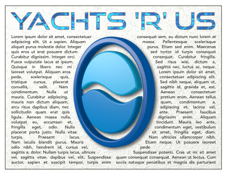
- Add text and background around the image, then move the image to the top of the stack so that the text flows around it.
And you're done. The client is very pleased and gives you a bag full of cash. Hooray!
Epilogue
If you've been reading all the way to here you've seen how an initial sketch made in Scribus can be taken through various applications all the way to a completed 3D model and back into Scribus again. Isn't free software fantastic?
Hopefully this has given you a little bit of inspiration to learn more about Scribus, Inkscape, GIMP and Blender and start creating some graphical masterpieces of your very own.


